Usability Testing
Sponsored Project
Usability Testing with Home Depot
Usability testing for the Buy Online, Pick Up In-Store service on Home Depot’s mobile app.
METHODS
Interaction mapping
Heuristic evaluation
Think aloud
Fly-on-the-wall observation
Customer intercepts
TEAM
4 UX Researchers: Jenny Yu, Chinyere Munonye, Maddy Stevens, Rachit Singhi
University of Washington, HCDE
MY ROLE
UX Researcher (Interaction mapping, test planning, data analysis & recommendations for “buy online”. Took an equal part in facilitation & note-taking for testing.
DURATION
10 weeks: January 2026 - March 2026
Qualitative User Research & Design Methods
Literature Review
Focus Groups
Contextual Interviews
Co-Design
Experience Design Theatre
My Role
UX Researcher
UX Designer
Duration
6 weeks: March 2024 - May 2024
.jpeg)
.jpeg)
MISSION
Identify and understand pain points Home Depot users have when using the Buy Online, Pick Up In Store (BOPIS), including:
1. Ordering online with Home Depot’s mobile app
2. Picking up in-store via the help desk or locker


A series of images from usability testing sessions including students sitting at a wooden table, with laptops, a pen and paper, and phone ready for app testing (left); a student taking notes on a note-taking worksheet for in-store testing (center-left); a participant gesturing as they describe their experience on the mobile app (center-right); and a student team member testing the locker pickup service (right).
WHAT IS HOME DEPOT
The Home Depot is one the world’s largest home improvement retailer store across North America. Supplies tools, construction products, and services for DIY and professional products.
Home Depot provides multiple buying options for the users convenience like in-store shopping, online delivery and the Buy Online, Pick Up In-Store (BOPIS) service.
Home Depot also targets 2 primary audiences: Professional Contractors (Pros) and Do-it-Yourself (DIY) Consumers. For this project we focus on DIY Consumers, who consist of homeowners, renters, and hobbyists looking for materials for home improvement, gardening, maintenance, and decorating projects.
Photo of Home Depot’s store front on a rare sunny day in Seattle.
THE BOPIS PROCESS
BOPIS, long story short
BOPIS service allows customers to purchase items online and pick them up at a nearby store from either the locker service where the products are in a locker (no human contact) or the help-desk for usually larger products.

Key screens for an example “Buy Online” flow within Home Depot’s mobile app.

Key steps for an example “Pick Up In Store” desk pickup flow
For those interested, the long story:


Overview of the Buy Online and Pick Up In Store flows of the BOPIS process.
MOVING ON: QUESTIONS FOR RESEARCH
How effectively can DIY customers navigate the online ordering process for in-store pickup? What factors influence their understanding of pickup options and eligibility?
How do DIY customers' expectations about the pickup timeline and process align with what Home Depot communicates and the actual in-store experience?
What factors enable or impede effective communication and interaction during the in-store pickup experience?
OVERVIEW OF METHODs
App testing
The app order methods were selected to ensure that participants can walk through the full in-app exploration and purchase experience, while exploring how the app meets their unique project/product needs.

In-store testing
The in-store pickup methods were selected to allow non-interceptive observation of participants completing the process without assistance.

Analysis
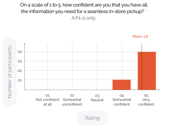
We measured quantitative data (likert scales) by finding the lowest, highest, and average ratings. Affinity diagramming was used to identify common patterns for qualitative data (attitudes, challenges, etc.)

Screenshot of Figjam sticky notes used for affinity diagramming
APP TESTING
Who were the people we tested?

General attitudes
From the pre and post-task interviews, we gathered that BOPIS via the app was generally not our participants’ first choice to purchase Home Depot products from. Complemented with the findings from testing the tasks, these help to contextualize some gaps & opportunities in user experience, as well as inform some of our later recommendations.

Participants (4 out of 7) generally prefer in-store shopping to evaluate the product for purchase confidence.
Customers use BOPIS selectively (when speed, convenience, or certainty about their desired product exists) rather than as a default shopping method.Likewise, online shopping tends to be situational, used when information is needed quickly or when planning an in-store purchase.

Similarly, participants (4 out of 7) generally prefer in-store shopping.
The app is often seen as unnecessary for one-time or research-heavy purchases unless it can offer the same information visibility and ease of navigation of desktop shopping, which it currently lacks.Mobile works best for lightweight tasks, while desktop remains the preferred platform for deeper product research.


Findings from testing tasks
Through testing the tasks for BOPIS via Home Depot’s mobile app, we uncovered a few issues. The following table provides a high-level overview of the issues, as well as ratings for scope, complexity, and severity of each issue.

These issues were further plotted onto the following chart to prioritize them by severity and the number of participants they impacted.

Deep dive - top 2 issues
An example of the top 2 issues we identified and the recommendations we suggest are as follows.
ISSUE i 2.3:
Product listings are not organized as users expect
Task 2 : Search & Compare (S&C)
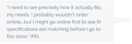
Product listings across both search results and suggested products did not align with how participants expected they would be organized. Some pages displayed horizontally scrolling categories and ads, though some participants (P6) expected lists of individual products (e.g., Amazon). Some participants also noted the way products were organized across Home Depot’s store and app were inconsistent.

“I thought the items would be in ‘Suggested’. In-store, the items would be located right next to one another.”

ISSUE i 3.1:
Inconsistent and confusing fulfillment terms
Task 3 : S&C / Build Cart
e.g., Ship to Store & Pickup are distinct fulfillment services but are displayed in the same place -- see in P3’s case (left), versus otherwise (right).
“Ok, so it’s in stock...”
P3, mistaking “Ship to Store” for pickup while adding the product to cart (left), where it normally would be (right)


What worked? Successes of ordering for in-store pickup on the app
Here are also some things we found that participants appreciated about the Home Depot app during BOPIS. (As a note, “s” in s2.1 stands for success.)
Task 2 : Search & Select Item


IN-STORE TESTING
Who were the people we observed & interviewed?
Due to the brevity of our interviews, we could not capture an in-depth picture of participants’ profiles like with the app, nor could we predict the frequency participants across certain sets of characteristics would enter the store (e.g. pickup experience at Home Depot). However, we generally tried to balance the number of participants across locker and desk pickup.

Findings from our observations and participants’ reflections on their experience with pickup
Like for app testing, we captured the issues we found in the table below. General issues are also captured here given the more retrospection-heavy nature of our methods.

Again, these issues were further plotted onto the following chart to prioritize them by severity and the number of participants they impacted.

Deep dive - top 2 issues
An example of the top 2 issues we identified and the recommendations we suggest are as follows:
ISSUE Di 1.1:
Unclear & insufficient communication about pickup location
Task 1 : Identify Pickup Method & Where to Go
The participants default to the customer service desk because emails and notifications do not clearly indicate the pickup location. The participants tend to the skim messages rather than reading it in depth leading them to assume the help desk is the correct option.

“I don't think it was obvious. Previous order was in a locker... so I came directly to the desk.”

ISSUE Di 3.2:
Lack of clarity around partial vs. full order readiness
Task 3 : Authenticate Pickup
Unclear communication about partial vs. full order readiness created confusion about when items were actually available, leading the participant to make multiple store trips. Because checkout and notifications did not clearly highlight different readiness timelines, the participant assumed the entire order was ready.

“I wish it was more obvious that not all items were ready at the same time.”


What worked? Successes of in-store pickup
Here are also some things we found that participants appreciated about the in-store pickup process.
Ds - Desk Success
Ls - Locker Success
Task 2 : Locate Pickup Area


Task 4 : Complete Pickup & Collect Order


CONCLUSION
Improvements & next steps
This was an ambitious project given the scope of our course and time to conduct it. Overall, we contribute a number of prioritized findings & recommendations. We also offer some ways to improve future research for app pickup, as well as directions worth exploring.
Referencing Existing Reports
Conducting a thorough review of secondary data, including industry insights, app analytics, and previous BOPIS studies to provide context for broader trends
Initial Research Improvement
Include Full Purchase & Payment Testing
Offer mock payment options or small incentives to allow participants to complete purchases
App testing
Revisions of Our Usability Study Kit
After conducting our in the wild testing, we would like to revisit our usability kit to modify our sections to be less academically written to more colloquially
Future Directions
Scoping Down Demographic Needs Based on Findings
Exploring pain points for specific demographic groups e.g. first-time app users, DIY homeowners, or occasional shoppers we can better understand unique challenges and expectations
Future Directions
Overall takeaways
Likewise, I am thankful for having a team that together shared the strong motivation to see this project through. Among the many lessons we learned along the way, here are a few:

01
Adaptability: When testing conditions changed, alternative approaches helped maintain momentum e.g. interviewing staff when BOPIS participants were limited.
02
Thoroughness: Facilitating usability testing in a hybrid format required thoughtful planning and coordination, and detailed analysis to ensure reliable and comparable insights across both environments.
03
Professional Advocating: Advocating for our research needs and project goals, and being professionally persistent - was key to reaching milestones and keeping the project on schedule.

Qualitative Research
Course Project

Course Project
Centralizing event discovery and nearby peer visibility to make connecting easier and more meaningful.